
Thrifty
Project Overview

The Work
The Case study is for the creation of a E-Commerce website which acts as a platform for thrift stores in India and its customers for making purchases easily within their budget with better user experience. At the same time making it easier for Thrift businesses to operate as freeing them from responsibilities of logistics and customer support and focusing them on finding and selling products.
Duration - 2 weeks
My Role - UX Designer
The problem:
-
Customer support.
-
Right Size and details.
-
lack of filters.
-
Not finding what we are looking for.
The Goal:
The goal of the case study is to create an E-commerce platform that is more responsive for Thrift customers and helps Thrift stores reach a wider audience and an easier way to sell their products.
User Research
Summary
The User Research is to figure out what features we should add to an e-commerce app made for thrifting enthusiasts. along with that, we look into the market and the need for the app. Along with a Robust Backend system for thrift store owners that can help organize their products and provide better logistical and customer support to them. In recent years Thrifting has become extremely popular for people looking to purchase vintage clothes and also for people trying to survive on a strict budget. It has also been seen as a good way of being more sustainable which has made it popular among the new generation.
Persona & User Journey

Jane Doe
"Thrifting is cheap and sustainable also it kind of goes against fast fashion that I don't believe in."
Demographics
Age:- 28
Education:- B.A
Hometown:- Dombevali
Family:- Single
Occupation:- Marketing
Goals
-
To Buy lot of clothes
-
To be more sustainable
-
Trying something new without heavy impact on pocket.
-
Finding hidden vintage gems
Frustrations
-
Too much time to deliver
-
Size maybe different.
-
Not available in size.
-
Some thrift owners do not give description of problems.
Jane is from Dombevali currently staying in Mumbai working for a Marketing firm. She loves fashion therefore spends a lot of money on clothes. Therefore she thrifts as its cheaper. She is also against fast fashion and believes in sustainable living. Therefore she found thrifting the right choice for herself.
Problem statement:- Jane works in Marketing in Mumbai who needs to buy clothes and try out new styles Because she loves Fashion.
Action
Task List
Emotions
Improvement
Opening Instagram
Looking through a Thrift store Profile
waiting for reply
Finding something cute
Dming store for details and price
finding something else that can go with it.
unable to visualise them together
Finding something you like and dming
placing order on both
finally waiting on delivery
waiting for dispatch
waiting on shipping number
Area to improve
Details on dispatch along with tracking in the app can help making customers feel at ease
Area To improve
a description of the product, any damages or other details and their pricing.
Area to improve
Providing options on what could suit that dress can be helpful to user.
Area to improve
Instead of going to multiple places one place for several thriftier can help in selection.

Final delivery
Looking to create a new style
Finding something you like
Finding to match
going to another profile
finding some thing on another profile and placing order


Kaji
"It is a cheaper and sustainable alternative to fast fashion especially with the sharp rise in inflation. It is also so people don't have to look at their pockets to find themselves."
Demographics
Age:- 23
Education:- B.com
Hometown:- Darjeling
Family:- Single
Occupation:- owner of thrift store
Goals
-
Provide premium thrifting experience at your finger tips.
-
Providing a sustainable and cheap alternative to fast fashion.
-
Letting people be themselves.
Frustrations
-
Looking for the perfect products.
-
There are times when some products get lost in the shuffle.
-
Getting the word out.
Kaji runs a Thrift store and sells her finds online through Instagram. The idea came to her while she was studying in the US, where she and her friends loved hunting for awesome vintage stuff at thrift shops. They all loved finding unique treasures at great prices, and that's how Kaji's store was born!
Problem statement:- Kaji Owner of a thrift store who needs to Sell her products and also purchase new bulks Because She wants people to be able to love clothes as much as she does.
Action
Task List
Emotions
Improvement
Opening Instagram
uploading images
Eventually using Instagram Ads
Putting Stories of products on sale
Putting older stock in Stories still up for sale
If item present for a while figuring out right price which could gain profit.
Getting DM for order
Getting Payment in UPI
Waiting for more orders to dispatch together
Area To improve
A way to get delivery service that can collect order immidiately or provide way to inform customer about status
Area To improve
A way to advertise products on the app and putting new in front
Area To improve
Making sure to bringing products that are in stock to the top so they are not forgotten
Area To improve
A centralized system to get orders so address not mixed up
Final delivery
Stocking new products
Older Stock
Getting order
Writing Descriptions and setting prices
Advertising new products
getting the address
Checking adress
Sending for delivery by post slow but cheaper.

Pain points
1
Description on quality and year.
Customer may like to know more about the product.
2
Lack of filter
It may be good idea to have filters and sort buttons for easier shopping experience.
3
Unable to visualise
sometimes people need help seeing what are the things that would go with the product.
4
Problems in Delivery
Sometimes there may be problems in delivery timing or lack of information to customers.
Starting The Design Process
Paper Wireframes
Create an app that is user friendly and accessible for a wide audience to buy clothes from online thrift store. We will also create a backend App for easy access by mobile phones for sellers to upload their goods with all the necessary information so Users can get the best goods possible.


Low Fidelity Prototype

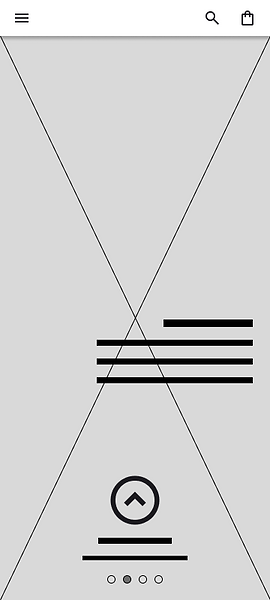.png)
.png)


.png)


Low Fidelity Prototype Summary.
Get a sneak peek of our app's core functionality with our low-fidelity prototype! This stripped-down version focuses on the essential steps users will take to purchase a product. Experience the process of logging in, browsing for your desired item, and completing a secure purchase. We've also included key details and information architecture to simulate the decision-making process for users. This allows us to gather valuable feedback on the app's usability and user flow before we invest time in intricate design elements and aesthetics. Ready to try it out? Click Here
Usability Study
We are creating a new app for art enthusiasts, collectors and artists to share paintings and Auction the work that comes through the Gallery.
Findings
Affinity Digram

Low Fidelity Prototype Findings
1
Text and images need to be bigger
2
Cart button needs to be available
3
Final confirmation window before checkout
Low Fidelity Prototype Back-End


.png)


Low Fidelity Prototype Summary.
Explore a basic version of the seller dashboard with our low-fidelity backend prototype. This sneak peek gives sellers a head start on what to expect when managing their business on the app. Try out logging in, see how you can analyze market trends to price your items competitively, explore shipping options, and even upload some of your products. This prototype helps us gather valuable feedback on the seller experience before we polish the design and add more features. Ready to see what it's like? Click Here
Usability Study
We are creating a new app for art enthusiasts, collectors and artists to share paintings and Auction the work that comes through the Gallery.
1
Lower Panel should be present in all pages.
High Fidelity Prototype
Post-Usability Study Mockups
1
Continuing with Cart instead of home.

1
1

2
Security pin if using mobile number

.png)
2
.png)

.png)
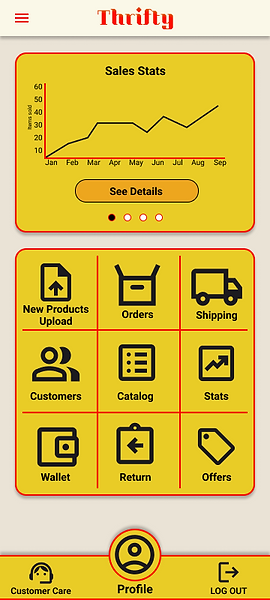
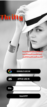
High Fidelity Prototype
.png)

.png)
_edited_edited.jpg)
.png)
.png)

.png)

.png)
.png)
.png)
High-Fidelity Prototype Summary.
We've listened closely to your feedback from our low-fidelity prototype usability study. Based on your valuable insights, we've refined the user flow for a smoother experience. The design has also received a visual refresh, incorporating color schemes and icons to bring the app's personality to life. Accessibility is a top priority, so we've increased the size of images and text to ensure everyone can easily navigate the app.
To see the result of the changes and experience the high-fidelity prototype Click here.
Usability Study 2
High Fidelity Prototype Findings
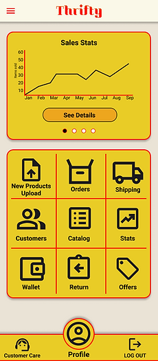
1
Yellow is too bright
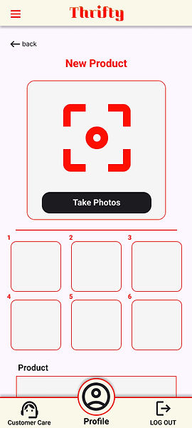
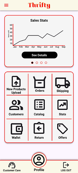
High Fidelity Prototype Back-end
_edited.jpg)

.png)

.png)

.png)
.png)
.png)
High-Fidelity Prototype Back-end Summary.
Building the best seller experience is a priority, and your feedback from the low-fidelity prototype was invaluable. We incorporated suggestions to make the seller dashboard even more intuitive and efficient.
This high-fidelity prototype brings the dashboard to life with icons, clear text, and all the details you need to manage your business on the go. Explore features like product listing, market analysis, shipping options, and more in a visually appealing and user-friendly format.
Ready to see the seller experience in action? Click Here
Usability Study 2
High Fidelity Prototype Findings
1
Yellow is too bright
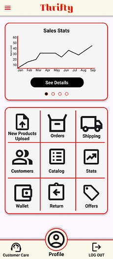
Mockups
Post-Usability Study Mockups
1
1
yellow too bright
.png)
1
.png)
1
yellow too bright
.png)
2
.png)
.png)
Mockup
.png)
.png)
.png)
_edited.jpg)
.png)
.png)
.png)
.png)
.png)
.png)
.png)
.png)
High Fidelity Prototype Summary.
Based on the usability studies I conducted, which included both users and backend sellers, we received feedback from 6 out of 10 individuals that the yellow color was too bright. Therefore, for the front end, I decided to remove yellow and opted for a black-and-white color scheme to create a neutral and more accessible design. We checked the color scheme against the Web Content Accessibility Guidelines (WCAG) and found no issues. Consequently, we have incorporated this new color combination in our final mockups.
To see the result of the changes and experience the Mockup Click here.
Mockup Back-end
_edited.jpg)
_edited.jpg)
.png)
_edited.jpg)
.png)
.png)
.png)
.png)
.png)
High Fidelity Prototype Summary.
As mentioned earlier, the backend for the thrift store faced similar issues with the color palette. We made adjustments to enhance usability. Backends are designed to be functional rather than fancy, prioritizing ease of use and speed. Therefore, we implemented large, intuitive buttons that facilitate quick navigation as soon as you open the app.
Ready to see the seller experience in action? Click Here
Takeaways
Impact.
The Design can be used to create a thrift store app for people who want to buy and sell clothes without being subject to cheaters or scammers.
It can also be helpful for sellers to manage their inventory and provide the correct information to the customer.
What I Learnt?
UX Research For back-end apps and software need to be quick and acessible it doesn't need to be fancy like the front end.