
IT Services Website
Project Overview

The Work
This is a case study is for a IT Services Startup that is looking to create a new website for their company. This is a user research and Usability study I am conducting on their behalf to provide the right direction for them to take in order to create a website that will help them get more customers and increase their business. We will conduct a Usability study of their current website. And also an Audit of their competitors to get a better idea of the current trends. I will be creating a few wireframes to give a visual understanding of the website.
Duration - November 2023 to January 2024
My Role - UX Researcher
The problem:
-
Visually Appealing
-
Lack of consistency
-
Lack of Organisation
-
More Modern
The Goal:
-
Complete A User Research on Need for IT Service Website.
-
Competitive Audit of IT Services Website
-
Usability Study of The Current Website
Target Audience:
-
Corporate managers
-
Corporate Directors
-
Startups
-
Logistic companies
-
People Looking for a job in IT.
User Research
Summary
I conducted user interviews, which I then turned into empathy maps to better understand the target user and their needs. I conducted several interviews with normal office professionals, Entrepreneurs, etc. and created 2 personas representing them, and a User Journey map about their work. Through the process we identified a few pain points that may help in creating a better website for driving more business. I also conducted a Competitive Audit to better understand the competition and the type of site that would work best with the Target audience. Finally I conducted a usability study that looked into the current website. It yielded good results and defines what we need to work on to make a successful website.
Personas & User Journeys

Sach
"My job means being able to convince someone that we are a better option even if we may be a costlier option in the long run we provide better results"
Demographics
Age:- 42
Education:- B.A.
Hometown:- Mumbai
Family:- Married
Occupation:- Sales
Goals
-
To have more time.
-
Making sure client is happy with purchase.
-
To have Support from my team when required
Frustrations
-
“Inability to be at more than one place.”
-
“Lack of time.”
-
More efficient support and communication from my team
Sach is a Sales lead that works in Mumbai. He has two major responsibilities the first is to take care of his family and the second is to hit all his sales targets. Their are times he is unable to meet his second objective due to Lack of communication in chain of command, small miscommunication within the team etc.
Problem statement:- Sach is a Sales Team Leader who needs to Make things more effective at his office because He wants to drive up his sales numbers.
Action
Task List
Emotions
Improvement
Working on Temp fix.
FInding problems causing issues.
Communicating with superior about issue.
Finding if they have a solution in line of work
.Find reason the issue is happening
Find people that can help create a solution
Informing superior about people you may have found with solution.
Connecting with company or individual.
Discussing right time.
Setting a meeting date
Finalizing details of product and deadlines for its application.
Discussing budget and how to move forward.
If IT Services websites can be precise according to industry on website for better User flow. Also keeping things organised.
Connecting with the client easily can help improve chances. Contacting them to understand problem and give feedback. By insight through forms.


Finalising details
Finding the issue
Finding people who can work on it.
Communicating with superior
Communicating with individual or comp.
Details of issue and temporary fix.


Anshne
"I have to manage everything my self at the moment. It is extremely stressful but also equally exciting and rewarding."
Demographics
Age:- 28
Education:- M.B.A
Hometown:- Mumbai
Family:- Single
Occupation:- Entrepreneur
Location:- Remote
Goals
-
To meet targets.
-
Make sure customer satisfied with end product.
-
Effective communication with team
Frustrations
-
“Inability to give precise instructions to team online.”
-
“Lack of time.”
-
"Finding right people for the right job.
Anshne is an Entrepreneur she handles several customers/clients in her line of work. In certain situations she hires external contractors to do the job. She has her own team that works offsite. Her priority is to build her business and in order to do that she has to keep on getting clients.
Problem statement:- Anshne is a Entrepreneur in Mumbai who needs to Be able to increase performance of her team and get better people to work for her because she wants to deliver effective results to the customer/client,
Action
Task List
Emotions
Improvement
giving perspective on situation
Getting details of work/requirements
Finding what they need it for and why?
finding people with expertise in the subject
giving brief to team about scope of work
Figuring out what they would require.
getting details from the team of what maybe required.
contacting people in social circle and social media
see if they have worked on similar issues
after finding people communicating with what you need and the timeline
communicating to check on progress regularly
Getting details ready and handing it over
Being active on social media maybe helpful in the long run like Reddit, Twitter etc
Add finishing touches and deliver
Communicating with team
Communicating with client/customer
Details of work examples in simple words with explanations using diagrams make company feel approachable
Contacting right people in right field
Contacting Specialists
A system that can give clients regular updates can reduce stress on client and improve productivity


Pain Points
1
COMMUNICATION
PROBLEMS
Communication problems between clients and company about scope of work.
2
LACK OF SUPPORT
Clients may feel lost because he may not get regular updates.
3
LACK OF INFORMATION
Unnecessary delays due to lack of understanding in solutions for different industries.
Competitive Audit
Infosys
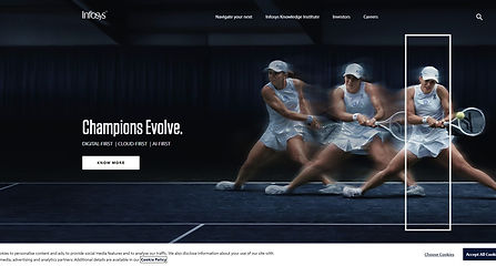
Infosys is a multinational corporation that provides information technology (IT) consulting, services, and outsourcing. It is one of the largest IT services companies globally. Infosys offers a range of services, including software development, maintenance, and consulting, as well as business process outsourcing. The company has a significant presence in various industries, such as finance, healthcare, manufacturing, retail, and more.
Result
The Infosys website is clean with a mix of Single image and Box design making it pleasant visually. Along with that their Burger menu is well organized according to Industries, Services, Platforms, etc. Along with the burger menu having enough negative space between them making it more accessible. I do have one issue with the sub menu that is "the font should be bold or semi-bold" to make things clearer. Navigation is easy to use and the overall user experience is pleasant. Their case studies do not have an excess of information instead they have a brief description a video about the case study which is easy to understand, and links that allow you to learn more about the service. The career page is based on a search system (Because of the size of the company and the volume of jobs available). This is easy to navigate and you have to create an account or login to apply for the job. This is probably because of the AI system that goes through application to find the right match. Overall It is a well organized and thought out website that is simple and appealing visually.
Genpact

Genpact, founded in 1997 as a business unit of General Electric (GE) and later established as an independent company, is a global professional services firm headquartered in New York City. Specializing in digital transformation, business process management, and outsourcing services, Genpact operates on a global scale, with a presence in numerous countries. The company offers a diverse range of services, including business process outsourcing (BPO), technology services, analytics, consulting, and digital transformation solutions. With a focus on helping businesses adapt to the digital era, Genpact continues to play a significant role in supporting businesses in their journey towards operational excellence and digital advancement.
Result
The Genpact website is a Box design website with a color scheme of Dark blue, White, Pink, and Light blue. It has a top bar menu instead of a burger menu and also a header with buttons connecting to pages for official use like career, Media, Events, etc. Their homepage looks bright and balanced. One of the boxes covers Services which is divided into Digital (Automation, AI, etc.) and Business(Customer care, Risk and compliance, etc.). But the top bar menu button's dropdown for Services doesn't have that distinction made I think that should be added for consistency and accessibility considerations. It also has a clear distinction of industries it can help and each page has details of how they can help a particular industry. It also has individual buttons with details of the sub-industries it can provide services to for example Banking and Capital Market has buttons for Automotive Finance, Capital Markets, Commercial Banking, Fintech, etc. My overall impression of the site is that it's very organized, detailed without being overbearing and easy to navigate.
Soroco

Soroco is a company that focuses on providing solutions in the realm of intelligent process automation. Headquartered in Bengaluru, India, Soroco aims to enhance operational efficiency and streamline business processes through the use of artificial intelligence and automation technologies. The company specializes in developing software that can automate routine, rule-based tasks, allowing organizations to optimize their workflows and allocate human resources to more strategic and creative endeavors.
Soroco's solutions often leverage machine learning and other advanced technologies to understand and mimic human actions in a digital environment. By automating repetitive tasks, Soroco aims to help businesses reduce costs, minimize errors, and improve overall productivity.
Result
Soroco website is very simple visually, it utilizes pastel colors and box design layout. It does add a lot creative interactive design that makes the website eye catching like the work graph page has a interactive wheel on the top which is eye catching. But at the same time the homepage slider on the top has uneven slides which jump sizes every time they change. The motion design as we scroll may be an old concept but it gives a little flair to the website. The top bar at times is replaced by a quick access bar in the scout pages I believe that may be a bad design choice and should be moved to the side as it causes unnecessary delays in using scroll to teach to the original top bar for other pages to access. Another problem I noticed is the career page when you select a particular opening the whole website seems to have been moved to the side in certain openings (Product Marketing Manager (SaaS AI Product)) this seems to have been a developing error that can be fixed easily. Overall the website is visually appealing but has a few flaws that need to be take care of.
Usability Study
Current Website


Current Website
The Current website is a mixture of Purple, White, and Grey. According to WCAG Standards, there are issues in the text and color combination with a score of 4.61 to 3.61 which is not very accessible for color blind people. The text is small in certain areas which is not on the level of accessibility for visually challenged people. We conducted a Usability study to find out more about the current website in order to create a website that works well for the image of the company and the users as a whole.
Findings
We conducted a Usability study on the current website to better understand what may be required for a good functional website for an IT company. We chose people of different ages and professions that may require or have worked with an IT firm.
Affinity Digram

Current website Findings
1
Fonts need to be clearer and sizes need to have some level of consistency.
2
Most Users did not like the colors some perceived it as too bright. while others felt there was lack of coherence between the colors used?
3
3 Users felt the Photos of the founders needed to be more consistent and professional.
4
One of the bigger flaws was a lack of understanding of what the company is involved in or does. One of the users from an IT background believed they needed to be clearer.
5
The style currently being portrayed is very old and needs to be updated.
6
The GIFF in the beginning is is too dark.
7
A list of openings in the career screen can help prevent an overload of un-required applicants.
Low-Fidelity Design
Ideation
After seeing the websites of other IT services companies we get a better idea of how we can make the website more eye-catching and professional. The companies involved in the competitive audit are all in one way or another direct competitors to ABC company. They may have a few flaws but all of them are simplistic and eye catching.
Another source for understanding and solution would be the Usability study I conducted on the current website. It gave us insights into several issues that users brought up while exploring the website that we categorized into Affinity diagrams by the amount of severity.
Ideation board

Design
Using what I learnt from the Ideation Process which is the result of the usability study and the competitive audit, we start the design process for the creation of the website. Putting the target Audience and the company in focus I plan om creating a website that is interactive easy to understand and focuses on the strengths of the company.
Site map

Wireframes
Summary
With all the research we were able to come up with several pain points in the current website and also an understanding of what the site should have through competitive audits. Using both these methods we were able to create an Ideation Board. The ideation board was useful in clearing out the direction of the project, the information architecture, and the layout. With these details in hand, we were able to create a sitemap and decide to go with a box layout for our wireframes.
Image Slides related to company.
Home

A simple bar of clients logos if too many can have slide animation
A brief description. Details will be in ABOUT US.
Unlike before there are clearly defined openings for people to apply so there isn't an overload of applications.

Dropdown menu with hyperlinks
and a visual representaion.
A box with summaries of services provided. These are divided into services and industries it is applicable to.
Future research or prospects.
all contact details.
Menu
Services
Career
Name of service and brief 2 line description.
Industries the service can be utilized in. And the opposite in industries.
A slide show an interactive web chart, or a video on how the service works. Also the advantages in applying the service to your industry.


To make perspective employees feel more open and secure.
openings in table format for easier access.
To give an insight into the company.
Next Step
1
Getting Green Light
The next step would be to get a green light to create a low-fidelity prototype and do a usability study.
2
Prototype
Based on the results of the usability study we can start working on a high-fidelity prototype.
3
Finishing touches& development